Most of us are already on the internet. However, what is commonplace for a non-disabled person is perceived differently by a person with disabilities. Hence more and more attention is being paid to web accessibility for everyone.
Make differently-abled people feel comfortable in your eshop. In the next lines, you will learn how to create an accessible web design and content for all.

Table Of Contents
On the internet, we get access to important information, products or tools at a moment’s notice that allows us to do almost anything online. Yet it is significantly harder for people with disabilities to take advantage of the benefits this world has to offer.
Up to 90% of websites are not fully accessible for those who rely on assistive technology.
Web Accessibility à la Eshop for All
Accessibility means a simple design and clear structure of the web not only for all kinds of users but also for robots.
While technologies such as screen readers, Braille terminals and alternative keywords enable people with disabilities to navigate the internet, eshops can go one step further.
Quick design changes can help you make your website accessible to people all over the world.
Why make websites accessible?
Around 15% of the world’s population lives with a disability. This number is likely to increase as people live longer and experience vision, motor function, or hearing limitations.
Content accessibility provides:
- Equal access to the website, services and content for your target audience
- Protection from potential fines and lawsuits resulting from non-compliance with laws and accessible sites
- Reaching a wider market

Online retailers in the UK have lost almost £17 billion by ignoring potential customers with disabilities. A lack of web accessibility caused a possible loss of their spending power of up to billions of pounds.
Numerical statistics
- Up to 71% of customers with disabilities will leave a website with a poorly accessible website.
- More than half of adults with impairments use the internet.
- 82% of differently-abled customers would spend more money online if websites were more accessible.
- The use of mobile screen readers has increased by 70% since 2011.
Practical Advice for a Content Accessibility
The goal of an accessible website and responsive design is to remove any barriers that limit navigation or understanding of the content on your ecommerce site.
Consider a suitable CMS system
Are you just launching your eshop? Or are you considering replacing your content management system? Think ahead and choose one that supports accessibility adjustments.
Make sure that the page layout, web design, themes, widgets or plugins are compatible with web accessibility standards such as Web Content Accessibility Guidelines: WCAG 2.0.
For elements such as editing toolbars and video players, make sure they support the creation of accessible content. Editing toolbars should include options for titles and headings, video players should include options for hidden captions.

When choosing a CMS for your eshop, think about publishing comments or blog posts. Users with disabilities should not be disadvantaged in these aspects either.
Don’t forget about headings and subheadings
Headings help to structure the content on a web page into a clear and easy-to-read format. Not only do they ensure that users don’t get lost on the page, but they also help you rise in Google’s eyes.
Set up a logical headline structure (<h1>, <h2> or <h3>) on your website. This will keep your content organised and easy to interpret for users with text readers.
Use headings correctly:
- Always use <h1> as the main page title. Avoid using <h1> for anything other than individual page titles.
- Use headings exclusively to structure your content. Do not mark the text itself as a heading.
- Don’t skip heading levels (from <h1> to <h3>), as reader users will miss the content.
Add ALT tags to images
Images on your ecommerce website provide added value to users. Yet they create a barrier for partially sighted or users with visual impairment.
ALT tags in images allow users with reading apps to understand what is in the image. Additionally, by utilizing the ALT feature, you are also increasing your SEO score.
Do you know what ALT tags should look like? Always try to use relevant keywords to describe what you see in the photo or image.
Be careful with colours
Colours help a non-disabled user distinguish between different sets of information. However, for people with colour vision deficiency or with different visual impairments, high contrast colours are a disaster.

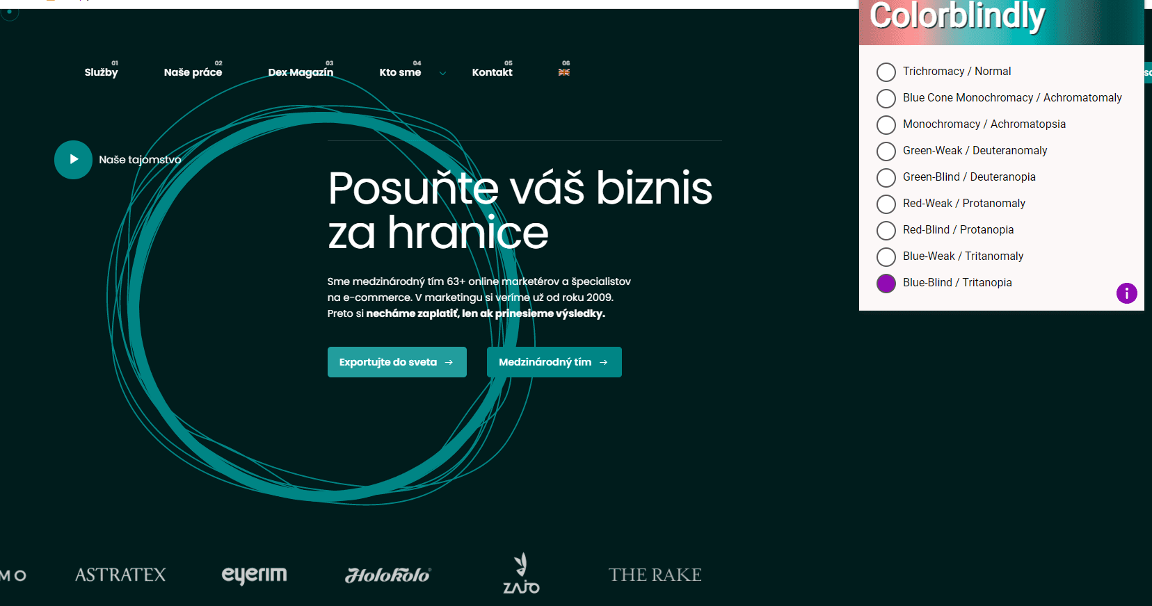
The Colourblindly extension shows how accessible the Dexfinity website is for users who have a visual impairment.
If you want a colour accessible web design, extend your browser with Colorblindly. It will let you know how people with colour perception disabilities see your eshop and which colours to use in your accessible web design.
Tag the forms
When designing online forms, it’s important to properly label text fields with a descriptive name so that people who rely on screen readers can fill out the forms correctly.
Enable using a keyboard to navigate the page
One of the most important parts of web accessibility is providing barrier-free navigation for millions of users with motor and visual impairments.

Check if your eshop can be fully navigated using a tab key, arrow keys or alternative tools.
Name the links
When adding links to your content, use text that correctly describes where the link will go. The phrase ‘Click here’ is not considered descriptive and is insufficient for a screen reader user.
The most unique content of the link should be presented first, as users often scroll through a list of links by searching for the first letter.
For example, if you are referring visitors to a page titled ‘About Us’, avoid the phrase ‘Click here to read about our company’. For example, refine the text: ‘To learn more about our company, read About Us.’
Make dynamic content accessible
Screen readers may not know about it when content is updated dynamically (without refreshing the page). Dynamic content includes screen overlays with banners, lightboxes, on-page updates, or contextual windows.
Users who only use the keyboard can quickly get lost on the page.
Accessible Rich Internet Applications: ARIA attributes are used to semantically mark up information for disabled users. They ensure that video players do not start automatically and can also be controlled with the keyboard.

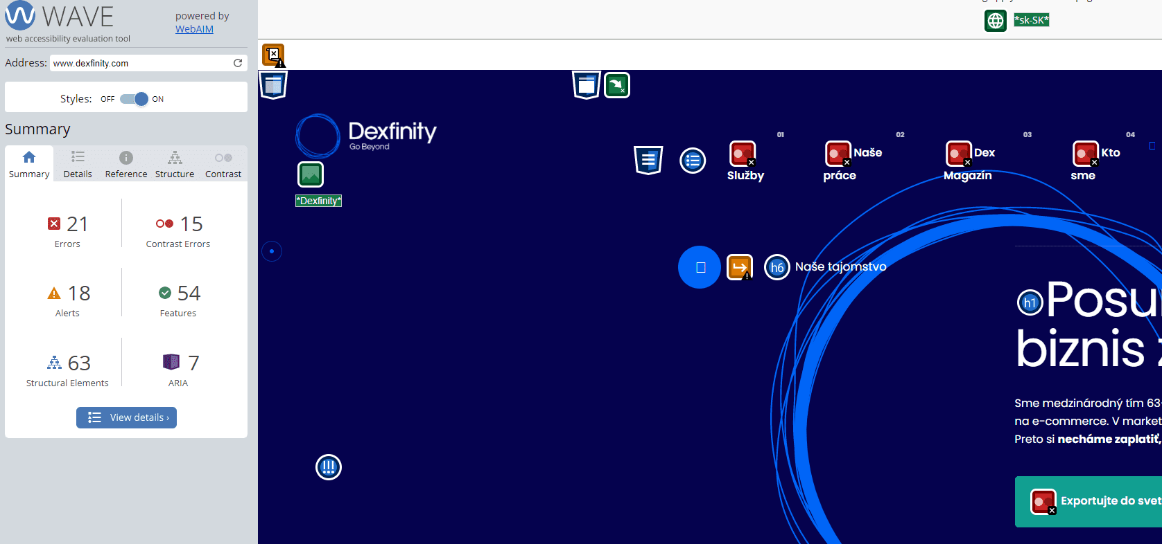
Find out if your eshop is accessible. Experte Accessibility Checker is a web accessibility evaluation tool that detects WCAG errors. The tool is free and can be used without registration.
An Accessible Website Matters
Have you ever wondered how people with disabilities perceive your eshop? Avoid losing potential customers and make it easier for them to navigate your website.
If you can’t get to grips with your website or other marketing activity, get in touch and together we will discuss ways to drive sales for your eshop. The first consultation is on us and without any obligation.
Thanks to the Dexfinity Editorial Staff for Creating This Article
Author: Veronika Svajčiaková
Editor: Martin Bartl
Translator: Mária Streďanská
Publisher: Róbert Hošták

DIRECT CONTACTS
Let's Join Forces!
Show us your project and we will talk about its growth potential.

Pavol Adamčák
Executive Director
+421 918 435 105
pavol.adamcak@dexfinity.com

Vladimír Nociar
Head of Business Development team
+421 903 568 464
vladimir.nociar@dexfinity.com
Choose what you are interested in and feel free to mark multiple choices.

