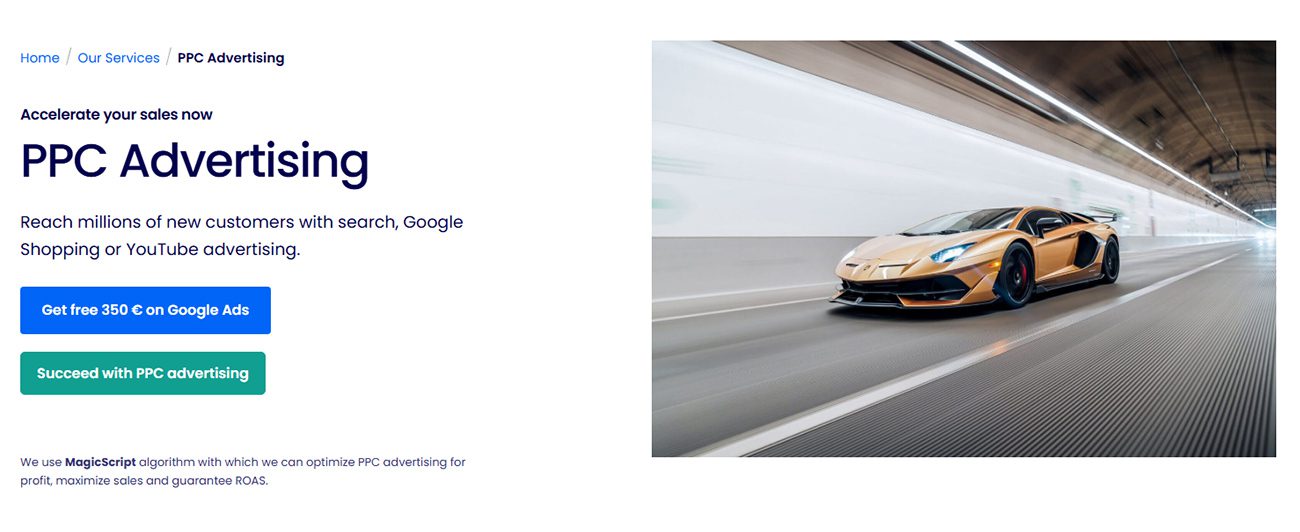
CTA is an abbreviation of Call to Action. In marketing, it is used to encourge a certain reaction or purchase from the visitor. CTA elements usually appear on websites, applications or online advertising.
The simplest CTA elements look like commands (“add to cart”, “buy”, “register”) or phrases that call for action (“subscribe today”, “I want to get free parking”, etc.) .

At Dexfinity, we often use CTA elements, especially on subpages like PPC Advertising from where we navigate readers further into the structure of the website.
Quality CTA elements accompany the website visitor throughout the entire customer journey, make it easier for them to navigate the site and help turn their visit into a conversion. A well-chosen CTA helps increase the conversion rate, which is one of the most important performance indicators in online marketing.
What characteristics should a CTA element have?
- Dynamic: You should write in such a way as to persuade the reader to take action – use action words and be clear.
- Concise and to the point: The CTA element must be clear at first glance. Don’t allow the reader hesitate and don’t surprise them by making them clicking their way onto a page that is not related to the CTA element.
- Expressive: If you want the visitor to really do something, don’t be afraid to repeat it. The CTA element can be repeated several times on one subpage.
- Persuasive: Sometimes all of the above is not enough and people need a little push. For example, you can set a CTA element of “book a room today” and add “pay conveniently later” below it in smaller font.
The best CTA is a tested CTA
Create CTA elements with consideration to the target audience, its language and method of communication. Do not work with assumptions – instead, test the CTA element by using an A/B test. Play with different designs, colour, text and placement. Analyse the results and choose the most powerful version based on the available data.

